
Information Without An Image Is A Boat Without An Anchor
Introduction to Visual Anchoring
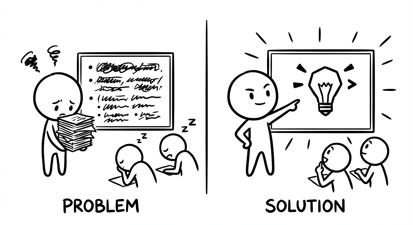
Picture this. You spend hours crafting the perfect pitch deck, polishing every bullet point, tightening every sentence. You hit send, walk into the meeting, or post it online… and the response is flat. No questions. No follow-up. Just that awkward silence that whispers, “They did not get it.”
That gap between your effort and their reaction is where visual anchoring lives. When information has no clear visual anchor, it behaves like a boat without an anchor on choppy water. It drifts past the very people who need it most. Your ideas might be sharp and your data solid, but without a visual point the brain can grab, everything slides past and disappears.
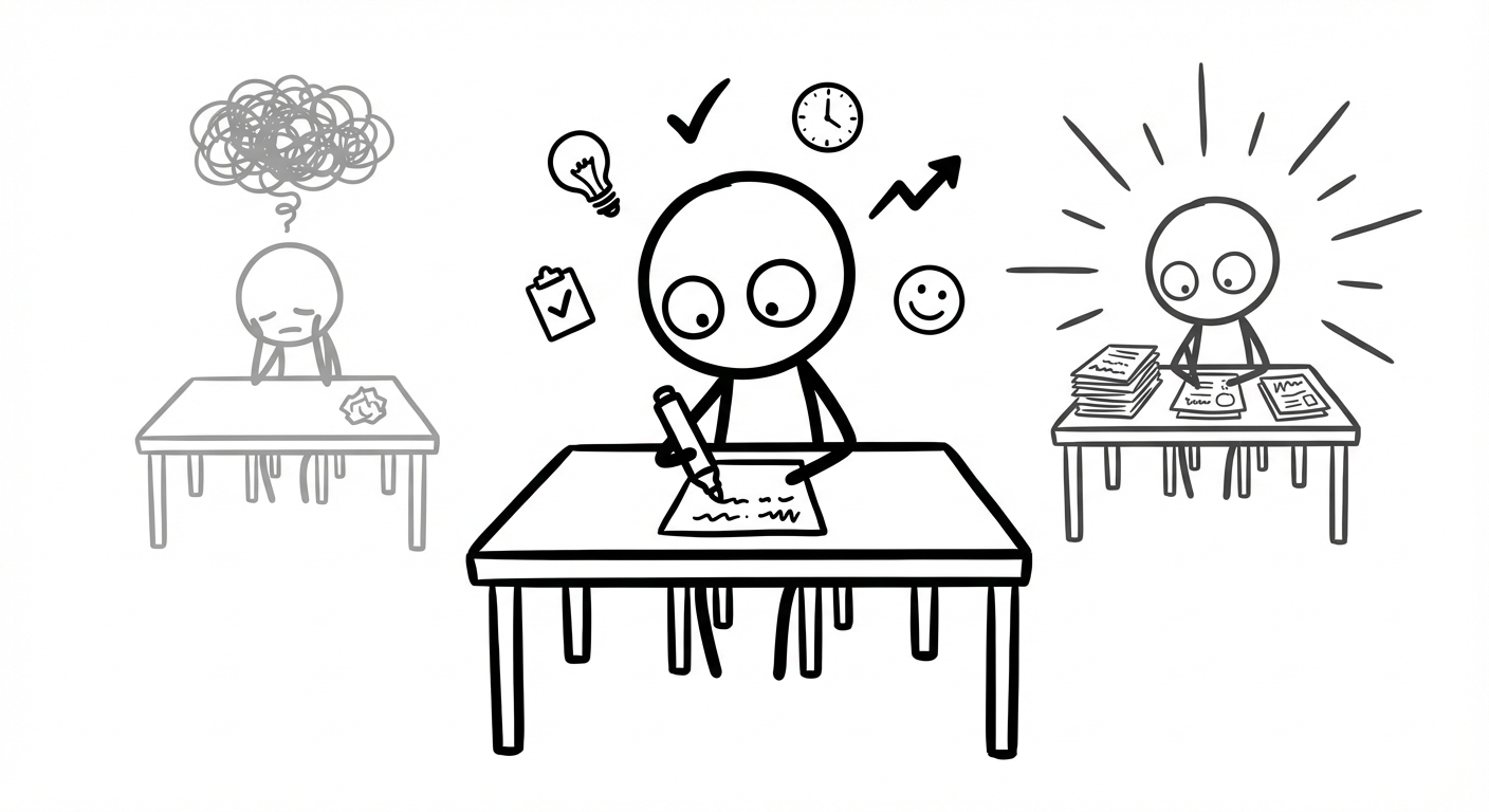
Most business owners and professionals do not struggle with knowledge. They struggle with visibility. There is a painful gap between what you know and what your audience actually remembers from your reports, lectures, posts, or calls. Text-heavy slides, dense emails, and “bullet point walls” overload the brain, and the brain simply checks out.
Visual anchoring is the missing bridge. It lines up how you speak with how the human brain prefers to see. It turns cognitive science into practical tools, so that your quarterly review, your social post, or your study notes land fast and stick longer.
In this article, you will walk through the logic that powers our work with clients across high-pressure fields. You will see how visual anchoring works, why it changes business outcomes, and how you can apply it across websites, emails, presentation decks, and social feeds without becoming a designer. By the end, you will have a clear, repeatable way to stop your information drifting away unnoticed.
“A picture is worth a thousand words.”
– Traditional proverb
Key Takeaways
- Visual anchoring accepts that information overload is real and uses images, icons, and layout as the first layer of meaning. This is faster for the brain than reading, so attention does not leak away in the first few seconds.
- First impressions are almost always visual, so what someone sees first sets the tone for everything that follows. A strong anchor makes the rest of your information feel clearer and easier to accept.
- Consistent visual anchors such as colours, logo placement, and layout patterns build memory structures over time. The brain starts to recognise you on sight and file you under “familiar and safe”.
- Systems such Drawlah’s approach mean you do not need a design degree to apply visual anchoring. Templates, automation, and simple hand-drawn canvases keep production fast and affordable.
What Is Visual Anchoring? (And Why Your Business Communication Keeps Failing Without It)
Visual anchoring is the idea that one visual element should lead the way for everything else on the screen or page. It might be an image, a bold block of colour, an icon, or even a number that dominates the space. Your audience’s eye lands there first, and that first impression frames how they understand the rest of your message.
This is very different from “making things look nice”. Pretty layouts without a clear anchor still make the brain work too hard. Visual anchoring is about control. You choose what the eye sees first, and by doing that, you shape what the brain treats as important. When the anchor is deliberate, you guide attention. When it is random, your audience guides themselves – usually straight to the exit.
Psychology calls this the anchoring effect: humans lean heavily on the first piece of information they meet when making a judgement, and research on (PDF) The Persuasive Power of data visualization confirms that visual elements significantly influence how audiences process and accept information. In communication, that “first piece” is almost always visual. Before a single sentence is read, the brain has already formed an opinion based on shape, contrast, and imagery.
Think about a hawker stall menu in Penang or Petaling Jaya. The board might list twenty dishes, but one large, glossy photo of nasi lemak sits in the centre. That photo is the anchor. It sets your expectation of portion size, taste, and even price before you read a word. Make that photo unappetising, and the entire stall feels less appealing. Make it mouth-watering, and your brain fills in the rest.
A common objection appears here: “I am not a designer.” That does not matter. You do not need to be a chef to know whether food tastes good, and you do not need to be a designer to see whether a slide lands or confuses. Visual anchoring is about simple choices anyone can learn, not about drawing perfect illustrations.
Supporting this is dual coding theory. Your brain stores information in two channels, verbal and visual. When you use both together, memory becomes more stable and recall is faster. When you rely on text alone, you are asking the brain to work with one hand tied behind its back. A text-only quarterly report or LinkedIn post with no visual anchor is like asking someone to memorise a long phone number they heard once in a noisy café. Most of it vanishes within hours.
“Above all else, show the data.”
– Edward Tufte
The Psychological Foundations And Why Images Override Everything Else

Visual anchoring works because of how the human brain is built, not because designers enjoy pretty screens. Visual information is processed far faster than text in many studies. Pattern recognition is almost instant, while reading is slow, deliberate work. That difference is your unfair advantage when you lead with an image.
Psychologist Daniel Kahneman describes two thinking modes – System 1 (fast, automatic, emotional) and System 2 (slower, careful, logical) – and understanding Digital Anchoring: How IT shapes employee judgment helps businesses apply these cognitive principles to digital communication contexts.
A strong visual anchor hits System 1 first. It sets the emotional tone and a rough meaning before System 2 even starts reading. By the time someone reaches your paragraph, their brain has already decided whether this feels promising or tiring.
The primacy effect adds another layer. We remember and trust the first thing we see or hear more than the rest. That is why the hero section of a website or the opening slide of a pitch deck is not “just the intro”. It is the mental anchor that everything else hangs from. If that first screen is a wall of text, your audience’s brain learns one thing fast – this will be hard work.
Visual anchors also cut cognitive load. Reading long paragraphs burns energy. Interpreting a simple diagram or icon uses far less. When you anchor a message with a clear visual, you are not dumbing it down. You are respecting how the brain prefers to process information.
Our agency work at Iwi Digital sees this pattern again and again with Malaysian SMEs and regional B2B teams. A client can keep the same price, the same service stack, and the same logic in a proposal. The only change is a shift from text-heavy decks to visual-first slides with simple icons and diagrams. Close rates go up because decision-makers can finally see the offer at a glance instead of fighting through paragraphs.
The Business Case For Visual Anchoring From Invisible To Unmissable

Markets in Malaysia, Singapore, and the wider region move fast. Every inbox, WhatsApp group, and social feed is full of competing claims. Being “clear if someone reads carefully” is no longer enough. You need to be instantly understandable, even when your reader gives you only a few seconds of half-focus between meetings.
Visual anchoring tackles what Iwi Digital calls the nine-second email reality. Most business emails get scanned for just a few seconds before the recipient decides to delete, save for later, or reply. Plain text has almost no chance of communicating your value inside that tiny window. A strong visual anchor, such as a simple diagram or bold summary box, can do the heavy lifting in those few seconds and pull the reader into the details.
Trust is also built at speed through patterns the brain can recognise. When your brand uses the same anchor colour for buttons, a consistent layout for headers, and familiar icon styles across website, emails, and decks, the brain relaxes. It marks you as “known” instead of “random”. That sense of order often matters more to a buyer than one more paragraph of claims or credentials.
In crowded categories, this becomes a real edge. If your competitors send text-only proposals and fill their sites with generic stock photos, their messages blend into background noise. A visual-first approach with strong, simple anchors sets you apart instantly. You are no longer the eighth similar option. You are the one that is easy to understand and easy to remember.
Many teams worry that a visual shift sounds expensive or slow. That was true some years ago. It is not true now. With tools such as Drawlah and Canva, you can create on-brand anchors in minutes. You do not need a specialist designer in every meeting. You need a clear system and a small library of reusable visual patterns.
“Design is not just what it looks like and feels like. Design is how it works.”
– Steve Jobs
That is the heart of Drawlah. A digital doodle is not childish. It is a weapon against information overload. When you sketch the logic of a complex plan on a hand-drawn canvas and share it, you bypass the brain’s circuit breaker. People “get it” in seconds instead of sitting through twenty slides of small text.
How Visual Anchoring Drives Measurable Outcomes Across Your Funnel
Visual anchoring supports every stage of your marketing and sales path:
- Awareness: Social posts with bold colours, clear icons, or short looping clips stop the scroll. Algorithms reward that behaviour, so more people see you without extra ad spend.
- Consideration: Landing pages and email campaigns live or die on clarity. A page with a dominant hero image, one focused headline, and a high-contrast call-to-action gives visitors a clear next step. Bounce rates drop because people are not left wondering what to do.
- Conversion: Product pages that use real photos, benefit-focused diagrams, and trust badges near the “Pay” button calm doubts. Proposal decks that highlight key figures in simple charts help decision-makers defend your offer internally.
- Retention: Consistent anchors in onboarding emails, dashboards, and support material remind customers why they chose you. Repetition reduces buyer’s regret and makes referrals more likely.
The Anatomy Of A Powerful Visual Anchor And What Actually Works

A useful way to think about a visual anchor is as the loudest voice in the room that still speaks sense. It must stand out so the eye cannot miss it, but it must also move the story forward. Random attention-grabbing tricks just drain trust.
Strong anchors are built from a few core ingredients:
- Contrast and colour: Eyes are wired to hunt for difference. A bright button on a calm background or a bold red ribbon across a neutral slide pulls focus instantly. Many brands pick one “action colour” and use it only for clickable elements. Over time, the brain learns that this colour means, “You can act here.”
- Size and scale: In every culture, bigger signals “more important”. Your main headline, hero image, and primary call-to-action should be larger than any supporting detail. When everything shouts, nothing is heard.
- Placement: Most readers scan screens in an F or Z pattern, from top left across, then down. If your main anchor sits low or tucked away on the right, you are working against habit. Placing your biggest image and clearest statement near the top, above the fold, nudges attention to where you want it.
- Purposeful imagery: Decorative stock photos of people shaking hands or staring at laptops create noise. Purposeful imagery – icons that guide, real product shots, or Drawlah-style doodles that map a process – carries meaning. People remember these because they feel specific to your thinking.
- White space: When you surround your anchor with breathing room, with no competing text or graphics, the eye has no choice but to rest there. Luxury brands show this well: simple layouts, one strong product photo, almost nothing else.
- Consistency: One strong visual in one campaign is just a tactic. A visual system reused across your website, social posts, videos, and investor decks becomes a strategy. Every time your audience sees the same shade of blue, the same logo placement, or the same style of hand-drawn diagram, recognition gets faster.
Common Visual Anchoring Mistakes That Sabotage Your Communication
Even with good intentions, visual anchoring can backfire, and the (PDF) Impact of AI on how digital content is consumed reminds us that as technology evolves, the principles of clear visual communication become even more critical to cut through automated and AI-generated noise. The most frequent mistakes include:
- Too many anchors on one screen. A looping video, a bright banner, and a pop-up all fight for first place. The brain gives up and skips the whole thing. Decide on one primary anchor and let the rest be clearly secondary.
- Eye-catching but irrelevant images. People remember the dramatic photo or funny gif but have no idea what you were offering. Anchors must always serve the core message, not distract from it.
- Inconsistent anchors across platforms. Blue buttons on your site, green buttons in your emails, and completely different fonts on social channels force the brain to re-learn who you are each time.
- Ignoring mobile screens. A banner that looks strong on a big monitor can shrink into a thin strip on a phone or be pushed far down the page. If your anchor does not survive the small-screen test, it is not a real anchor.
- Replacing all text with images. That makes content hard to search, hard to translate, and hard to access for screen readers. The sweet spot: lead with a visual anchor, then support it with clear, readable text.
Implementing Visual Anchoring In Your Business With A Practical Roadmap

By now, the logic of visual anchoring probably feels clear, but looking at your current website, social feed, or slide library might still feel intimidating. You do not have to redesign everything this week. You simply need a structured way to start.
- Audit your current state.
Grab screenshots of your homepage, your last few social posts, a recent email campaign, and your standard presentation deck. For each one, ask, “What is the first thing my eye lands on, and does it match the main message?” If you hesitate or answer “nothing, really”, you have found a weak point. - Define your non-negotiable anchors.
Choose one action colour and reserve it only for clickable or tappable elements across all channels. Decide how your logo appears and where it usually sits. Clarify your visual voice – bold and high-energy, or calm and minimal. Then create three simple templates (social graphics, email headers, slides) that lock in those anchors. - Pick high-impact touchpoints first.
For many Malaysian SMEs, this is either the homepage hero section or the main LinkedIn or Instagram feed. Start there. On a website, redesign the top section around one strong image, a short promise, and a clear button. On social, commit to your new template for the next month. - Use modern tools to move faster.
Drawlah, the digital doodle method from Iwi Digital, helps you sketch complex ideas into simple, shareable canvases. Canva Pro or Adobe Express let non-designers drop those canvases into consistent layouts. Dynamic image generation can personalise visuals at scale without manual editing. - Test, measure, and adjust.
Before you change anything, record current metrics such as click-through rates, engagement, time-on-page, or reply rates. After you update your anchors, watch those numbers for a few weeks. Simple A/B tests, like trying two hero images or two button colours, show which anchor pulls more action. Keep asking people you trust, “What did you notice first?” and refine until their answers match your intention.
“Perfection is achieved, not when there is nothing more to add, but when there is nothing left to take away.”
– Antoine de Saint‑Exupéry
When To Bring In Expert Help (And When DIY Is Enough)
You can apply many visual anchoring principles yourself, especially if your brand is still young or focused on a small set of channels. If you already know your colours and fonts, and you are mostly working on social posts or simple email campaigns, template-based tools are usually enough. The key is discipline in using the same anchors again and again.
There are moments, though, when bringing in specialists saves you months of trial and error. If you are rebranding, preparing for a major fundraise, or selling into large organisations where perception of polish affects deal size, the cost of weak visuals is high. When your communication spans websites, dashboards, events, and learning material, the visual system needs deeper thinking.
This is where Iwi Digital focuses its work. The team helps organisations turn dense, expert-level thinking into visual systems that feel as sharp as the ideas behind them. Using human-centred design and dual coding theory, we build anchor patterns that can stretch from a Drawlah doodle in a workshop to a full pitch deck without losing clarity. Once the system exists, your team can execute within it.
If you notice that internal debates keep circling around fonts, colours, and layout while no-one is asking, “Does this help people understand faster?”, that is a warning sign. At that stage, an outside view can reset the focus on results instead of aesthetics.
Visual Anchoring Across Key Business Channels With Tactical Applications
Visual anchoring is not a single trick you copy and paste everywhere. It is a set of principles that adapts to each channel’s strengths and limits. The way someone scans a LinkedIn feed is not the same as how they listen in a boardroom, and both differ from how they read a sales email on a phone in a Grab ride.
What does stay constant is the role of the anchor. On every channel, you still ask the same questions:
- What should they notice first?
- What emotion or idea should that first glance carry?
- What is the next action I want them to take?
Once you can answer those clearly, you can shape the visual anchor to match.
In practice, this means thinking about format, speed, and context. Websites and landing pages have more room but must earn the scroll. Social media posts compete for attention in mere milliseconds. Email sits inside a crowded inbox where trust and familiarity matter a lot. Presentations, whether online or in person, face the twin dangers of boredom and overload.
The next sections show how to apply visual anchoring on four key channels you probably use every week. The examples are simple on purpose so that you can adapt them to your own tools and brand style.
Website And Landing Pages
The hero section of a website serves as your main focal point, anchoring visitors upon arrival. One dominant image or illustration, one sharp headline, and one clear button should do most of the work. When a visitor lands, they should be able to tell what you do and what to do next without scrolling or guessing.
Longer pages need a clear visual rhythm so that people do not get lost:
- Use subheadings, icons, and occasional diagrams as “micro-anchors” for each major section.
- Let visitors skim down the page, hopping from one anchor to the next, while still catching the main story.
Trust anchors deserve special attention. Payment logos, certifications, awards, and client logos work best when placed close to forms and buttons, not hidden at the bottom. On mobile, test how high they sit on the screen and whether they remain readable.
Social Media (LinkedIn, Instagram, Facebook)
On social platforms, your first battle is against the thumb. Posts must make sense even at thumbnail size. That means bold shapes, strong contrast, and a single focus point usually win. Text overlays should be short and large enough to read without squinting. Faces, clear product shots, and simple diagrams often outperform complicated collages.
Consistency is your best friend here. When you use the same colour band, corner logo, or layout grid in every post, followers start to recognise your content instantly as they scroll. They might pause on your post even before they know why. This is how visual anchoring supports algorithm changes and attention swings you cannot control.
Do not forget your static profile assets. Your profile image and cover banner are persistent anchors that often appear in search results and notifications. Make sure they are sharp, on-brand, and say something obvious about your category. In Stories and Reels, remember that the first frame is the hook. Lead with the outcome or most interesting moment, then explain how you got there.
Email Marketing
Email gives you more space than a social post but less forgiveness than a website. People are quick to delete. A branded header at the top of every campaign, with your logo and colours, tells the reader, “This is from someone you recognise.” That simple anchor can raise the chance they keep reading, especially when inboxes are full of phishing attempts.
Inside the email:
- Pick one main image rather than a crowded gallery.
- Make sure that hero visual mirrors your main message and points toward your primary call-to-action.
- Use the same action colour on the button and in parts of the image, so the whole email feels connected.
The call-to-action button itself is a vital anchor. Make it feel like a real button, not just coloured text. Surround it with enough empty space that it stands out, even when someone is glancing quickly. Align this with your subject line and preheader text, so the promise in the inbox matches the visual and action on open.
Presentations And Sales Decks
Presentations are where weak visual anchoring hurts the most, because the cost is live embarrassment. The rule of one idea per slide and one anchor per slide will save you. If you feel tempted to squeeze two important images or three charts onto the same slide, stop and create another slide. No-one complains that a clear deck had “too many simple slides”.
A safe default layout is:
- a strong title at the top
- one dominant visual in the middle
- a small amount of supporting text at the bottom
This keeps live audiences focused on you rather than reading paragraphs off the screen and makes your deck scannable for people reading it later. At Iwi Digital, entire case-study pages often become a single Drawlah diagram plus a few words – attention snaps back to the speaker.
Data deserves visual respect too. Charts and graphs are anchors only when simplified. Highlight the one number that matters with colour or increased weight and strip away gridlines and extra labels. If stakeholders want all the detail, put dense tables and full charts in an appendix. Present the clear version first so your key point is not buried.
Conclusion
Sending out information without a clear image or visual anchor is like pushing a boat off the pier with no anchor on board. It might look fine as it leaves, but once it hits busy water, it drifts wherever the current takes it. Most business communication sits in that open sea of emails, feeds, and tabs, drifting past the very people it was meant to help.
In fast-moving markets across Malaysia and beyond, being understood is not a luxury. It is a basic condition for winning attention, trust, and budgets. Competitors who learn to anchor their messages visually will be the ones remembered in meetings and exams, even when the content itself is similar to yours.
You do not need to call yourself “creative” to use visual anchoring well. This is not about drawing beautiful art. It is about making clear choices: deciding what should be seen first, placing it with care, and repeating that pattern until the brain accepts it as familiar. Those are business decisions as much as design decisions.
The good news is that the science, tools, and methods already exist. Whether you sketch on Drawlah, drop designs into Canva, or work with us at Iwi Digital, you can start small and move fast. You do not have to rebuild every asset overnight.
Open your most important customer-facing asset right now – your homepage, your LinkedIn profile, or your core pitch deck. Ask yourself, “What is the visual anchor here, and does it match what matters most?” If the answer is “none” or “not really”, you have found your starting point. Fix that one anchor, and you will feel why information without an image really is a boat without an anchor.
“If you can’t explain it simply, you don’t understand it well enough.”
– Commonly attributed to Albert Einstein
FAQs
Question 1 – Do I Need Expensive Design Software To Create Effective Visual Anchors?
You do not need costly software to use visual anchoring well. Many teams begin with free or low-cost tools such as Canva, Adobe Express, or simple whiteboard apps combined with Drawlah-style sketches from Iwi Digital workshops. What matters more than software is the thinking behind your anchors. A simple template used regularly with the same colours, fonts, and clear focal point will often beat a flashy one-off design. Invest your energy in the system first; tools can upgrade later.
Question 2 – How Do I Maintain Visual Consistency When I Have Multiple Team Members Posting Content?
Start by creating a short, practical style guide that fits on a single page. It should show your logo, list your action colour, name your fonts, and include a few examples of correct usage. Then set up shared templates in a tool like Canva for Teams or your presentation software, so everyone begins from the same base. Limit which parts are editable, such as headlines and photos, while anchors stay fixed. Once a month, run a quick visual review together and look for drift. Over time, the system does the heavy lifting.
Question 3 – What Is The Biggest Visual Anchoring Mistake Malaysian Businesses Make?
One of the biggest errors is relying heavily on bland stock photos that could belong to any company in any country. A smiling person in a blazer pointing at a laptop does not say anything about your method or your market. It anchors “generic corporate message” rather than your value. A better path is to use purposeful visuals: simple diagrams of your process, before-and-after photos of your work, or Drawlah-style doodles that map your thinking. If you can lift an image from your content and paste it onto a rival’s page without it feeling wrong, it is not a real anchor.